

排名
6
文章
6
粉丝
16
评论
8
{{item.articleTitle}}
{{item.blogName}} : {{item.content}}
ICP备案 :渝ICP备18016597号-1
网站信息:2018-2026TNBLOG.NET
技术交流:群号656732739
联系我们:contact@tnblog.net
公网安备: 50010702506256
50010702506256

欢迎加群交流技术

 分类:
uniapp
分类:
uniapp
官方文档地址:
https://ext.dcloud.net.cn/plugin?id=22
https://hellouniapp.dcloud.net.cn/pages/extUI/card/card
https://uniapp.dcloud.io/component/uniui/uni-card
官方demo位置:
部分效果: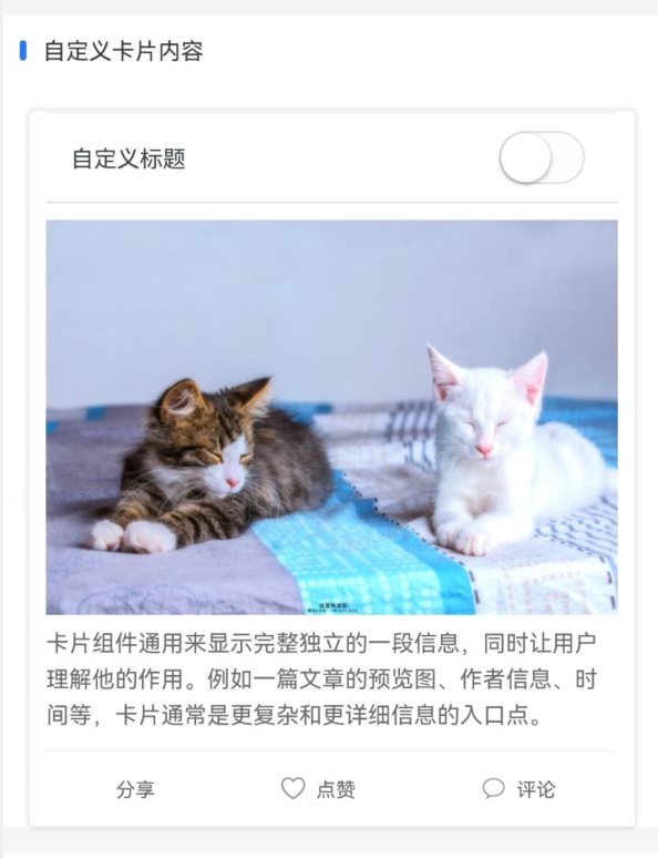
代码:
<template>
	<view>
		<text class="example-info">卡片组件通用来显示完整独立的一段信息,同时让用户理解他的作用。例如一篇文章的预览图、作者信息、时间等,卡片通常是更复杂和更详细信息的入口点。</text>
		<uni-section title="基础卡片" type="line"></uni-section>
		<view class="example-body">
			<uni-card @click="clickCard"><text class="content-box-text">这是一个基础卡片示例,内容较少,此示例不带边框阴影。</text></uni-card>
			<uni-card title="标题文字" isShadow @click="clickCard"><text class="content-box-text">这是一个基础卡片示例,内容比较多,内容样式可自定义,卡片视图常用来显示完整独立的一段信息,比如一篇文章的预览图、作者信息、时间等,此示例带边框阴影。</text></uni-card>
			<uni-card title="标题文字" extra="额外信息" isShadow note="Tips" @click="clickCard"><text class="content-box-text">这是一个相对比较完整的基础卡片示例,带有标题、额外信息以及底部信息,内容样式可自定义。</text></uni-card>
		</view>
		<uni-section title="通栏卡片" type="line"></uni-section>
		<view class="example-body">
			<view class="example-box">
				<uni-card title="标题文字" :isFull="true" isShadow='true' note="额外信息" extra="额外信息" @click="clickCard"><text class="content-box-text">通栏卡片,左右上下没有间距,用户可自定义卡片距离等信息</text></uni-card>
			</view>
		</view>

		<uni-section title="图文卡片" type="line"></uni-section>
		<view class="example-body">
			<uni-card :is-shadow="true" title="标题文字" mode="style" thumbnail="https://vkceyugu.cdn.bspapp.com/VKCEYUGU-dc-site/460d46d0-4fcc-11eb-8ff1-d5dcf8779628.png" extra="额外信息" note="true" @click="clickCard">
				<text class="content-box-text">图文卡片支持传入一张图片,在最上方显示,标题作为图片描述,额外信息作为内容标题,通常作用为作者信息或发布时间描述,自行配置是否需要底部信息</text>
				<block slot="footer">
					<view class="footer-box">
						<view class="" @click.stop="footerClick('喜欢')"><text class="footer-box__item">喜欢</text></view>
						<view class="" @click.stop="footerClick('评论')"><text class="footer-box__item">评论</text></view>
						<view class="" @click.stop="footerClick('分享')"><text class="footer-box__item">分享</text></view>
					</view>
				</block>
			</uni-card>
		</view>
		<uni-section title="标题卡片" type="line"></uni-section>
		<view class="example-body">
			<uni-card :isShadow="true" title="标题内容" subTitle="副标题" mode="title" thumbnail="https://vkceyugu.cdn.bspapp.com/VKCEYUGU-dc-site/460d46d0-4fcc-11eb-8ff1-d5dcf8779628.png" extra="技术没有上限" note="true" @click="clickCard">
				<view>
					<view class="image-box">
						<image class="image" mode="aspectFill" src="https://vkceyugu.cdn.bspapp.com/VKCEYUGU-dc-site/094a9dc0-50c0-11eb-b680-7980c8a877b8.jpg" />
					</view>
					<view class="content-box">
						<text class="content-box-text">标题卡片带有一个双标题头部,右侧为额外描述信息 ,内容可自定义实现</text>
					</view>
				</view>
				<template slot="footer">
					<view class="footer-box">
						<view @click.stop="footerClick('喜欢')"><text class="footer-box__item">喜欢</text></view>
						<view @click.stop="footerClick('评论')"><text class="footer-box__item">评论</text></view>
						<view @click.stop="footerClick('分享')"><text class="footer-box__item">分享</text></view>
					</view>
				</template>
			</uni-card>
		</view>
	</view>
</template>

<script>
	export default {
		components: {},
		data() {
			return {
				list: [{
					id: 0,
					title: '',
					content: '',
					shadow: false,
					note: '',
					extra: '',
					thumbnail: ''

				}, {
					id: 1,
					title: '标题文字',
					content: '',
					shadow: true,
					note: '',
					extra: '额外信息',
					thumbnail: ''
				}, {
					id: 2,
					title: '标题文字',
					content: '',
					shadow: true,
					note: 'Tips',
					extra: '额外信息',
					thumbnail: ''
				}, {
					id: 3,
					title: '标题文字',
					content: '这是一个完整配置的基础卡片示例。内容样式可自定义。',
					shadow: true,
					note: 'Tips',
					extra: '额外信息',
					thumbnail: 'https://vkceyugu.cdn.bspapp.com/VKCEYUGU-dc-site/460d46d0-4fcc-11eb-8ff1-d5dcf8779628.png'
				}],
				Tips: ['喜欢', '评论', '分享']
			}
		},
		methods: {
			clickCard() {
				uni.showToast({
					title: '点击卡片',
					icon: 'none'
				})
			},
			footerClick(types) {
				uni.showToast({
					title: types,
					icon: 'none'
				})
			}
		}
	}
</script>

<style>
	@charset "UTF-8";

	/* 头条小程序组件内不能引入字体 */
	/* #ifdef MP-TOUTIAO */
	@font-face {
		font-family: uniicons;
		font-weight: normal;
		font-style: normal;
		src: url("~@/static/uni.ttf") format("truetype");
	}

	/* #endif */
	/* #ifndef APP-NVUE */
	page {
		display: flex;
		flex-direction: column;
		box-sizing: border-box;
		background-color: #efeff4;
		min-height: 100%;
		height: auto;
	}

	view {
		font-size: 14px;
		line-height: inherit;
	}

	.example {
		padding: 0 15px 15px;
	}

	.example-info {
		padding: 15px;
		color: #3b4144;
		background: #ffffff;
	}

	.example-body {
		/* #ifndef APP-NVUE */
		display: flex;
		/* #endif */
		flex-direction: row;
		flex-wrap: wrap;
		justify-content: center;
		padding: 0;
		font-size: 14px;
		background-color: #ffffff;
	}

	/* #endif */
	.example {
		padding: 0 15px;
	}

	.example-info {
		/* #ifndef APP-NVUE */
		display: block;
		/* #endif */
		padding: 15px;
		color: #3b4144;
		background-color: #ffffff;
		font-size: 14px;
		line-height: 20px;
	}

	.example-info-text {
		font-size: 14px;
		line-height: 20px;
		color: #3b4144;
	}

	.example-body {
		flex-direction: column;
		padding: 15px;
		background-color: #ffffff;
	}

	.word-btn-white {
		font-size: 18px;
		color: #FFFFFF;
	}

	.word-btn {
		/* #ifndef APP-NVUE */
		display: flex;
		/* #endif */
		flex-direction: row;
		align-items: center;
		justify-content: center;
		border-radius: 6px;
		height: 48px;
		margin: 15px;
		background-color: #007AFF;
	}

	.word-btn--hover {
		background-color: #4ca2ff;
	}

	.example-body {
		/* #ifndef APP-NVUE */
		display: block;
		/* #endif */
		padding: 1px 0;
	}

	.example-box {
		margin: 12px 0;
	}

	.image-box {
		/* #ifndef APP-NVUE */
		display: flex;
		flex-direction: column;
		/* #endif */
		height: 350rpx;
		overflow: hidden;
	}

	.image {
		/* #ifndef APP-NVUE */
		width: 100%;
		height: 100%;
		/* #endif */
		flex: 1;
	}

	.content-box {
		padding-top: 20rpx;
	}

	.content-box-text {
		font-size: 12px;
		line-height: 22px;
	}

	.footer-box {
		/* #ifndef APP-NVUE */
		display: flex;
		/* #endif */
		justify-content: space-between;
		flex-direction: row;
	}

	.footer-box__item {
		align-items: center;
		padding: 2px 0;
		font-size: 12px;
		color: #666;
	}
</style>
不同的显示效果类型可选:
mode="style"
mode="basic"
mode="title"
欢迎加群讨论技术,1群:677373950(满了,可以加,但通过不了),2群:656732739。有需要软件开发,或者学习软件技术的朋友可以和我联系~(Q:815170684)
评价