

排名
6
文章
6
粉丝
16
评论
8
{{item.articleTitle}}
{{item.blogName}} : {{item.content}}
ICP备案 :渝ICP备18016597号-1
网站信息:2018-2026TNBLOG.NET
技术交流:群号656732739
联系我们:contact@tnblog.net
公网安备: 50010702506256
50010702506256

欢迎加群交流技术

 分类:
CSS
分类:
CSS
配合bootstrap4来写的,效果图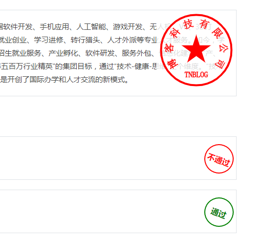
直接贴代码吧:
直接复制运行即可看到效果:
<!DOCTYPE html>
<html>

<head>
    <meta charset="utf-8" />
    <meta name="viewport" content="width=device-width, initial-scale=1.0" />
    <title>写样式中......</title>
    <link rel="stylesheet" href="https://cdn.staticfile.org/twitter-bootstrap/4.3.1/css/bootstrap.min.css">
    <script src="https://cdn.staticfile.org/jquery/3.2.1/jquery.min.js"></script>

    <style type="text/css">
        .box {
            position: relative;
            overflow: hidden;
            height: 260px;
        }

        .box img {
            width: 100%;
            height: 260px;
        }

        .box .box-content {
            width: 100%;
            height: 100%;
            position: absolute;
            top: 0;
            left: 0;
            color: #fff;
            text-align: center;
            padding: 20% 20px;
            background: rgba(0, 0, 0, 0.6);
            transform: rotate(-90deg);
            transform-origin: left top 0;
            transition: all 0.50s ease 0s;
        }

        .box .title {
            display: inline-block;
            font-size: 22px;
            color: #fff;
            margin: 0 0 15px 0;
            position: relative;
            transform: rotate(180deg);
            transform-origin: right top 0;
            transition: all .3s ease-in-out 0.2s;
        }

        .box .post {
            display: block;
            font-size: 18px;
            margin-bottom: 15px;
            transform: rotate(180deg);
            transform-origin: right top 0;
            transition: all .3s ease-in-out 0.4s;
        }

        .box .description {
            font-size: 15px;
            margin-bottom: 20px;
            padding: 0 20px;
            transform: rotate(180deg);
            transform-origin: right top 0;
            transition: all .3s ease-in-out 0.6s;
        }

        .box .read {
            font-size: 16px;
            font-weight: bold;
            color: #fff;
            display: block;
            letter-spacing: 2px;
            text-transform: uppercase;
            transform: rotate(180deg);
            transform-origin: right top 0;
            transition: all 0.3s ease-in-out 0.8s;
        }

        .box .read:hover {
            color: #e8802e;
            text-decoration: none;
        }

        .box:hover .box-content,
        .box:hover .title,
        .box:hover .post,
        .box:hover .description,
        .box:hover .read {
            transform: rotate(0deg);
        }
    </style>

    <style>
        @media (min-width: 1200px) {
            .container {
                max-width: 1200px;
            }
        }


        @media (min-width: 1440px) {
            .container {
                max-width: 1260px;
            }
        }

        @media (min-width: 1600px) {
            .container {
                max-width: 1350px;
            }
        }

        .professional_container .myborder {
            /* box-sizing: border-box;
            -moz-box-sizing: border-box;
            -webkit-box-sizing: border-box; */
            border: 1px solid #cbd1d6;
            /* Safari */
        }


        .professional_item {
            /* height: 115px; */
            /* margin: 0px 0px 16px 0px; */
            /* padding-top: 10px;
            padding-bottom: 6px; */
            cursor: pointer;
            margin: 15px 15px 0px 15px;
            height: 260px;
        }
    </style>

    <style type="text/css" name="文字盖章">
        .seal-content {
            width: 300px;
            min-height: 60px;
            vertical-align: bottom;
            word-wrap: break-word;
            position: relative;
        }

        .seal-result {
            width: 60px;
            height: 60px;
            transform: rotate(20deg);
            border: solid 2px green;
            border-radius: 100%;
            text-align: center;
            color: green;
            font-size: 16px;
            font-weight: bold;
            line-height: 60px;
            right: 5px;
            bottom: 12px;
            position: absolute;
            background-color: rgba(255, 255, 255, 0.8)
        }

        .seal-result-fail {
            border-color: red;
            color: red;
        }
    </style>

    <body>
        <header>

        </header>

        <div>
            <div style="margin-top:36px">
                <div style="font-weight: 600;font-size: 20px">培训方式</div>
                <div class="row border" style="margin-top: 20px;background: #fff;margin-left: 0px;margin-right: 0px">
                    <div style="color:#444;padding: 20px">
                        <span style="font-size: 15px;margin-top: 6px;clear: both;line-height: 1.8">
                            学院是西南地区较早开展IT互联网人才培养的教育品牌。通过十余年的发展与积淀,学院形成以大数据软件开发、手机应用、人工智能、游戏开发、无人机、VR、3D打印、室内装潢、电子商务等为主的多方向专业培养体系,并通过足下校园、足下课堂等线上平台提供就业创业、学习进修、转行猎头、人才外派等专业人才服务。如今,学院已形成了集互联网应用教育、课程体系与教材研发、教学管理、人才培养和人才服务、实习实训、招生就业服务、产业孵化、软件研发、服务外包、信息化建设等“产、学、研”一体化协同发展的生态系统,研发的134本教材被15个省市的50多所院校采用。学院秉承“培养五百万行业精英”的集团目标,通过“技术-健康-思维”三个维度。“技术型、管理型、创业型”高端软件人才。学院与加拿大荷兰学院、新加坡立腾学院等国际院校的合作,更是开创了国际办学和人才交流的新模式。
                        </span>
                        <div style="position: absolute;top: 0px;right: 0px;background-color: rgba(255, 255, 255, 0.8)">
                            <canvas id="canvas" width="163" height="163"></canvas>
                        </div>
                    </div>
                </div>
            </div>

            <div style="margin-top:32px">
                <div style="font-weight: 600;font-size: 20px">岗位师资认证培训</div>
                <div class="row border" style="margin-top: 20px;background: #fff;margin-left: 0px;margin-right: 0px">
                    <div style="color:#444;padding: 30px">
                        <span style="font-size: 15px;margin-top: 6px;clear: both;line-height: 1.8">
                            模块一:JAVA开发工程师-讲师资格认证
                        </span>
                        <div class="seal-result seal-result-fail">不通过</div>
                    </div>
                </div>
                <div class="row border" style="margin-top: 20px;background: #fff;margin-left: 0px;margin-right: 0px">
                    <div style="color:#444;padding: 30px">
                        <span style="font-size: 15px;margin-top: 6px;clear: both;line-height: 1.8">
                            模块一:JAVA开发工程师-讲师资格认证
                        </span>
                        <div>通过</div>
                    </div>
                </div>
                <div class="row border" style="margin-top: 20px;background: #fff;margin-left: 0px;margin-right: 0px">
                    <div style="color:#444;padding: 30px">
                        <span style="font-size: 15px;margin-top: 6px;clear: both;line-height: 1.8">
                            模块一:JAVA开发工程师-讲师资格认证
                        </span>
                        <div class="seal-result seal-result-fail">不通过</div>
                    </div>
                </div>
            </div>
        </div>

        </div>


        <div class="jumbotron text-center" style="margin-bottom:0;margin-top: 30px">
            <p>tnblog版权所有2018-2020</p>
        </div>

        <!-- bootstrap.bundle.min.js 用于弹窗、提示、下拉菜单,包含了 popper.min.js -->
        <script src="https://cdn.staticfile.org/popper.js/1.15.0/umd/popper.min.js"></script>
        <!-- 最新的 Bootstrap4 核心 JavaScript 文件 -->
        <script src="https://cdn.staticfile.org/twitter-bootstrap/4.3.1/js/bootstrap.min.js"></script>

        <script>

        </script>

        <script name="自定义印章">

            var canvas = document.getElementById("canvas");
            var context = canvas.getContext('2d');

            var text = "TNBLOG";
            var companyName = "博客科技有限公司";

            // 绘制印章边框
            var width = canvas.width / 2;
            var height = canvas.height / 2;


            context.lineWidth = 4;
            context.strokeStyle = "#f00";
            context.beginPath();
            context.arc(width, height, 72, 0, Math.PI * 2);//宽、高、半径(半径用来跳转外圈的大小)
            context.stroke();

            //画五角星
            create5star(context, width, height, 25, "#f00", 0);

            // 绘制印章名称
            context.font = '16px 宋体';
            context.textBaseline = 'middle';//设置文本的垂直对齐方式
            context.textAlign = 'center'; //设置文本的水平对对齐方式
            context.lineWidth = 1;
            context.strokeStyle = '#f00';
            context.strokeText(text, width, height + 50);

            // 绘制印章单位
            context.translate(width, height);// 平移到此位置,
            context.font = '20px 宋体';
            var count = companyName.length;// 字数
            var angle = 4 * Math.PI / (3 * (count - 1));// 字间角度
            var chars = companyName.split("");
            var c;
            for (var i = 0; i < count; i++) {
                c = chars[i];// 需要绘制的字符
                if (i == 0) {
                    context.rotate(5 * Math.PI / 6);

                } else {
                    context.rotate(angle);
                }

                context.save();
                context.translate(56, 0);// 平移到此位置,此时字和x轴垂直,公司名称和最外圈的距离
                context.rotate(Math.PI / 2);// 旋转90度,让字平行于x轴
                context.strokeText(c, 0, 0);// 此点为字的中心点
                context.restore();
            }

            //绘制五角星
            function create5star(context, sx, sy, radius, color, rotato) {
                context.save();
                context.fillStyle = color;
                context.translate(sx, sy);//移动坐标原点
                context.rotate(Math.PI + rotato);//旋转
                context.beginPath();//创建路径
                var x = Math.sin(0);
                var y = Math.cos(0);
                var dig = Math.PI / 5 * 4;
                for (var i = 0; i < 5; i++) {//画五角星的五条边
                    var x = Math.sin(i * dig);
                    var y = Math.cos(i * dig);
                    context.lineTo(x * radius, y * radius);
                }
                context.closePath();
                context.stroke();
                context.fill();
                context.restore();
            }

        </script>
    </body>

</html>
欢迎加群讨论技术,1群:677373950(满了,可以加,但通过不了),2群:656732739。有需要软件开发,或者学习软件技术的朋友可以和我联系~(Q:815170684)
评价