

排名
6
文章
6
粉丝
16
评论
8
{{item.articleTitle}}
{{item.blogName}} : {{item.content}}
ICP备案 :渝ICP备18016597号-1
网站信息:2018-2026TNBLOG.NET
技术交流:群号656732739
联系我们:contact@tnblog.net
公网安备: 50010702506256
50010702506256

欢迎加群交流技术

 分类:
CSS
分类:
CSS
如果是使用网格系统可以参考:https://www.tnblog.net/aojiancc2/article/details/4886
更多实现可以参考:https://www.tnblog.net/notebook/article/details/7790
使用flex布局的情况下,需要自定义宽度的div增加一个flex-grow:1即可
<div class="row">
    <div class="" style="flex-grow: 1; height: 500px;background:#000">
    </div>
    <div  style="background-color: #131313;height:500px;width:306px">
    </div>
</div>
这里外面的class="row",是bootstrap中使用了flex布局的
不用flex布局的情况下
有些时候用flex布局上面这样做,内容的动态改变会有点影响它,所以可以使用下面这种方法来做
1:左边固定宽度,右边自适应
<html>
<head>
    <title>Document</title>
    <style>

        baibody {
            margin: 0;
        }


        .stage {
            position: relative;
        }


        .left {
            position: absolute;
            left: 0;
            top: 0;
            background-color: #ffabcd;
            width: 200px;
            height: 500px;
        }


        .right {
            margin-left: 200px;
            background-color: #abcdff;
            height: 500px;
        }
    </style>
</head>
<body>
    <div class="stage">
        <div class="left">
        </div>
        <div class="right">
        </div>
    </div>
</body>
</html>
看看效果: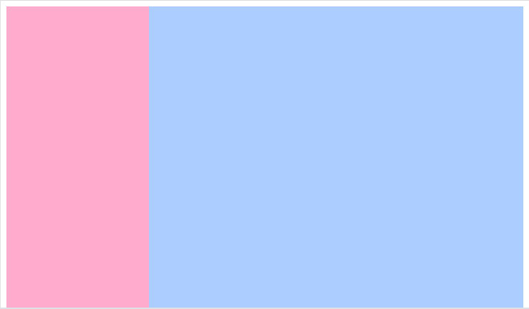
2:左边自适应宽度,右边固定宽度
<html>
<head>
    <title>Document</title>
    <style>

        baibody {
            margin: 0;
        }


        .stage {
            position: relative;
        }


        .right {
            position: absolute;
            right: 0;
            top: 0;
            background-color: #131313;
            width: 300px;
            height: 500px;
        }

        .left {
            margin-right: 300px;
            background-color: orange;
            height: 500px;
        }
    </style>
</head>
<body>
    <div class="stage">
        <div class="left">
        </div>
        <div class="right">
        </div>
    </div>
</body>
</html>
好了,效果就不贴了,继续听试讲了
欢迎加群讨论技术,1群:677373950(满了,可以加,但通过不了),2群:656732739。有需要软件开发,或者学习软件技术的朋友可以和我联系~(Q:815170684)
评价